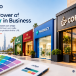

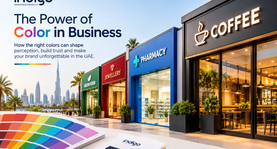
Walk down any commercial street in Dubai, Sharjah, or Ajman and you’ll notice something: the businesses that stick in your memory almost always have one thing in common — a distinct, consistent color identity. That’s not an accident. It’s color psychology at work, and it’s one of the most underused tools in UAE business branding.
Most business owners think about color last — after the logo is designed, after the signage vendor is chosen, sometimes even after the shop is already painted. But color is processed by the brain faster than shape or text, and it directly shapes how trustworthy, premium, affordable, or exciting a business feels before a customer reads a single word.
Why Color Comes Before Everything Else
Research in consumer psychology consistently shows that people form a judgment about a product or business within seconds of seeing it, and color is the dominant factor in that snap judgment. For a physical business — a retail shop, clinic, restaurant, or office — this happens at the exact moment someone looks up at your sign board or glances through your storefront window. You don’t get a second chance at that first impression, which is why the color decisions behind your signage, interior branding, and vehicle branding deserve the same strategic attention as your logo design.
What Different Colors Signal to UAE Customers
Color associations aren’t universal — they’re shaped by culture, industry norms, and context. In the UAE market specifically, a few patterns are worth knowing before you lock in a palette:
Gold and deep red are strongly associated with luxury, premium service, and hospitality — common in high-end retail, jewelry, and 5-star hospitality branding across Dubai.
Blue reads as trustworthy, professional, and calm. It’s the most common choice for corporate offices, healthcare, real estate, and finance-adjacent businesses because it lowers perceived risk in the customer’s mind.
Green signals health, freshness, and sustainability — a natural fit for F&B, wellness, and eco-conscious brands, and increasingly popular as UAE businesses lean into sustainability messaging.
Black and white with a single accent color projects modern, minimalist, high-end positioning — a look that’s become dominant in Dubai’s newer retail and F&B openings because it photographs well for social media and reads as confident rather than busy.
Bright, saturated colors (orange, yellow, hot pink) grab attention fastest, which makes them effective for quick-service businesses, salons, and promotional signage — but they can undercut a premium positioning if overused.
None of these are rules — they’re starting points. The right choice depends on your specific customer base, competitors, and what you want a passerby to feel in the three seconds it takes to walk past your storefront.
Where Color Consistency Actually Gets Tested
It’s easy to pick a brand color for a logo file. It’s much harder to keep that exact color consistent once it moves across materials — and this is where a lot of UAE businesses lose the impact of their branding without realizing it:
- Backlit and illuminated signage can shift a color’s tone depending on the acrylic or vinyl used and the LED temperature behind it — a brand blue can read noticeably cooler or warmer lit up at night than it does on a screen.
- Outdoor materials fade differently under Dubai’s sun and humidity — some pigments hold their color far longer than others, so a color that looks right on day one can drift within a year if the material wasn’t chosen with UV exposure in mind.
- Print vs. screen color rarely match exactly unless a business is working from defined CMYK/Pantone values rather than just a hex code — this is one of the most common reasons a shopfront sign ends up a slightly different shade than the website or business cards.
This is really a materials and production question as much as a design one, which is why color consistency is usually best handled by whoever is producing your signage and print materials — not just your graphic designer.
A Simple Way to Get This Right
You don’t need a 40-page brand book to fix this. What actually matters:
- Lock in your exact brand colors as CMYK and Pantone values (not just hex codes) so they translate correctly to print and signage.
- Share those values with every vendor — signage, printing, uniforms, packaging — rather than letting each one interpret “our blue” independently.
- Ask your signage provider which materials hold color best for your specific application (indoor vs. outdoor, illuminated vs. non-illuminated) before you commit.
Color is one of the fastest, lowest-cost ways to make a UAE business look more consistent and more intentional — but only if it’s carried through correctly from the logo to the storefront. If you’re planning new signage, interior branding, or a refresh of your existing setup, it’s worth getting the color specification right before production starts rather than after.